Today Wendy’s, the fast-food restaurant chain founded by Dave Thomas in 1969, is one of the largest and most popular in the global fast-food market, and one of the most recognizable due to its unconventional approach and innovative solutions. Brand’s square burgers are known the world over.
Meaning and history
In the early 1960s, fate brought future Wendy’s founder Dave Thomas together with the famous Colonel Sanders, who headed the KFC chain. The colonel suggested that Dave, then a chef in Indiana, buy a KFC franchise. Dave did a lot for the chain: increased margins and actually created the KFC logo. In the end, Sanders bought Thomas’s share for 1.5 million USD.
The history of the world-known brand Wendy’s began on November 15, 1969. On that day, entrepreneur Dave Thomas opened hisquick-service restaurant in Columbus, Ohio, named after one of his daughters, Melinda Lou, whom his siblings nicknamed Wendy’s.
Thomas decided not to follow standards and came up with the idea of selling square burgers, which worked beautifully and led the brand to incredible success. Also, one of Wendy’s most famous innovations was its one-stop shopping system.
In April 2009, the company merged with Arby’s brand, and since then, the new corporation Wendys/Arbys, Inc. is the third largest quick-service restaurant chain in the world. The combined network of Wendy’s, Arby’s, and Wendy’s/Arby’s includes more than 10 thousand locations in 24 countries, and more than 6 thousand operate under Wendy’s brand.
In 2010, Zagat, the American Restaurant Guide, ranked Wendy’s restaurants at the top of the Top Food category.
What is Wendy’s?
Wendy’s is the name of a famous American fast food restaurant chain, which was established in 1884, and by today has grown into one of the largest players in its segment, with almost seven thousand locations worldwide (most part in North America).
The Logo
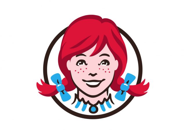
Starting from the very first version, Wendy’s logo has always featured the face of a red-haired girl, Wendy, after whom the restaurant chain was named. Wendy was the nickname of Melinda Lou, the daughter of the company’s founder.
Wendy’s branding creates an atmosphere of warmth, coziness, and homemade food. Many even see the word “Mom” written on the white collar of the girl’s outfit, although the creators of the logo claim it is simply an accident.
The visual identity of the famous fast-food chain has always been executed in one style and color palette and all seven versions of the emblem featured the same typeface color except for the logo, introduced by the company in 2013.
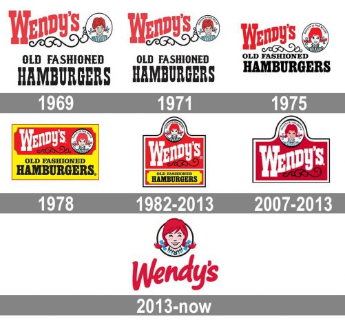
1969 – 1971

The logo, introduced by the company in 1969 featured a circular emblem placed on a wild-west cowboy-style nameplate with two lines of the lettering. The upper line was written in red, with the “Wendy’s” in the title-case, waved upright. The emblem with a red-hair girl was located on the left from the red inscription and underlined by a thin black ornament, dividing the bright and intense level from the monochrome one, where the “Old Fashioned Hamburgers” wordmark was set in black capitals of a fancy custom typeface.
1971 – 1975
In 1971 the contours of the logo were slightly modified, but it was still composed of red and black lettering and a portrait of Wendy’s founder’s daughter, enclosed in a circular frame. The only new thing on this version was a “Quality is Our Recipe” motto, which was sometimes added to the badge.
1975 – 1978
The redesign of 1975 changed the typeface of the bottom part of the logo, writing the “Hamburgers” in thicker lines, and making the “Old Fashioned” inscription a bit smaller than on the previous rebadged. The portrait of a girl was also redrawn, making her face white, which created a stronger color contrast and made the whole image brighter.
1978 – 1982
In 1978 the emblem was placed in a bright yellow rectangular banner, and the upper part of the nameplate was set on red, writing the name of the restaurant chain in white thick lines, keeping the original typeface. The “Old Fashioned” was moved to the center of the line, like it was in the very first version of the logo.
1982 – 2013
The circular emblem with the portrait moved to the top part of the badge and the main color of the background was switched to red in 1992. The “Wendy’s” inscription got enlarged and refined, while the “Old Fashioned Hamburgers” got their contours slightly narrowed and was set on a yellow banner on the bottom part of the emblem.
2007 – 2013
In 2007 the logo was simplified by removing its bottom part, and now it was composed of a red and white banner with “Wendy’s” wordmark on it and a circular emblem with the girl’s face above it. The badge was outlined in thin black, and looked modern and bright, reflecting the professionalism and the traditional approach of the company.
2013 – Today
With the redesign of 2013, the fast-food chain adopted a completely different logo. Though it was still built around two elements, a red-hair girl portrait in a circular frame and a red “Wendy’s” wordmark under it, the style and execution of both parts were more modern and progressive than it used to be. The new inscription is executed in a rounded sans-serif typeface with sleek thick lines, looking friendly and welcoming, while the girl’s portrait got slightly enlarged and now her hair is coming out of the thin black frame.
Font
In the 2013 Wendys logo, the old-fashioned serif typeface, which had been used since 1969,was replaced by a modern script resembling handwriting.
Color
The combination of red, light blue, and black with the white background creates a vibrant, attractive contrast.
What is the meaning of Wendy’s Logo?
The Wendy’s logo depicts a funny red-hair girl, who looks very friendly and energetic and brilliantly represents the welcoming character of the restaurant chain. Also, many people think there is a hidden message in the logo — the handwritten “Mom” set along the collar of the girl’s shirt standing for hospitality and warmth.
What does Wendy’s Logo symbolize?
The Wendy’s logo symbolizes the warmth of home and the caress of the family. It is executed in a bright intense color palette with red shades prevailing, which symbolized love and tenderness. The smiling face of the girl on the badge only elevates these feelings.
What is the hidden message in Wendy’s logo?
At first glance, Wendy’s logo looks pretty simple, but it has a hidden meaning. More specifically, there is a secret word hidden in the collar of Wendy’s blouse. It looks like the handwritten word “Mom”is set on the collar of the girl’s top. Many food sleuths have speculated that it’s a hint of the chain’s attempts to give the food a home-cooked feel, but Wendy’s management says the secret message was unintentional.
Why is Wendy’s mascot a girl?
The mascot of the company is Melinda Lou, the daughter of the chain’s founder, who was nicknamed “Wendy”. Hence, the restaurant was named in her honor, and there is no surprise she became the mascot of Wendy’s.
Why did Wendy’s change its logo?
In 2022 Wendy’s changed their logo in Canada, as a sign of support for Canadian journalist Lisa LaFlamme, who was fired because refused to dye her hair. That was the first time in the company’s history the iconic girl on the badge changed her hair color.
What is the story behind Wendy’s logo?
The Wendy’s logo was introduced at the end of the 1960s and depicts a funny red-hair girl, who is Melinda Lou “Wendy” Thomas-Morse, the daughter of Dave Thomas, the founder of the fast food restaurant chain. Morse is best known for being the namesake and mascot of the brand. She uses the name Wendy Thomas in her role as a spokesperson for Wendy’s.
Why does Wendy’s logo have a mom in it?
The Wendy’s logo is not as simple as can seem at the first glance. Many people have noticed a secret message in it — the word “Mom”, which is written in a stylized font along the collar of Wendy’s shirt. It elevates the feeling of warmth and represents the restaurant of the chain as a place to feel at home.
Who is Wendy’s logo girl?
Dave Thomas, the company’s founder, named his restaurant after one of his daughters, Melinda Lou, nicknamed “Wendy” by her brother and sisters. Hence, the girl from Wendy’s logo is Melinda Lou herself.
What year did Wendy’s turn red?
The visual identity of Wendy’s has always featured red as the main shade since the very first emblem of the brand was introduced in 1969. However, in 2007 red got even more space on the badge of company.

