In spite of the fact the word “Rossignol” means “nightingale” in French, the unofficial logo of the brand showcases a different bird. For much of the company’s history, the primary logo did not feature any bird at all, though.
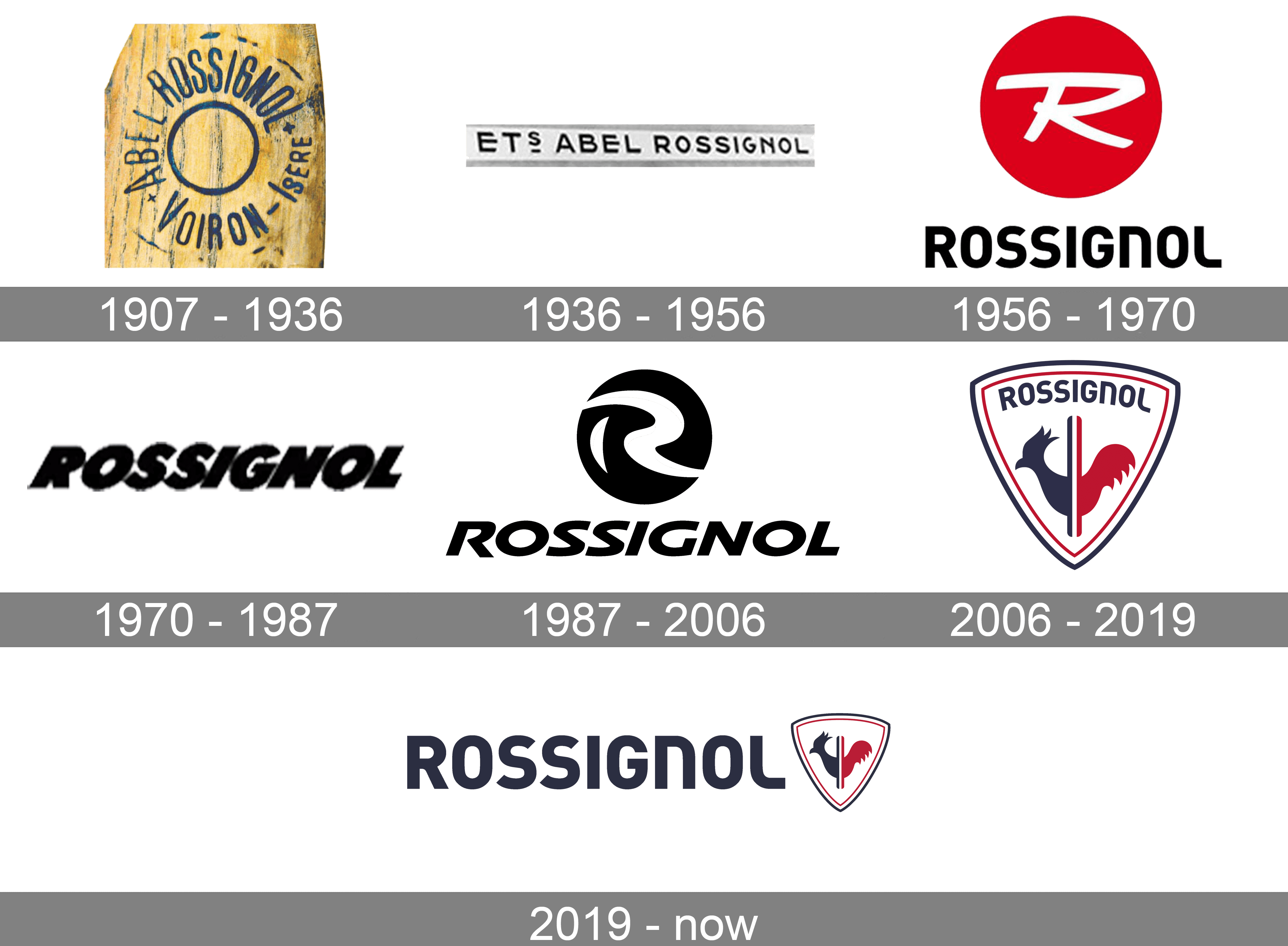
Rossignol is a well-known French manufacturer of skis, snowboards, and equipment for athletes. The company was founded in 1907 by a carpenter named Abel Rossignol. He first made wooden products for the textile industry and then switched to skis. Today the brand he created is recognized as one of the world leaders in its segment.
The company’s success came after winning a competition for sports equipment manufacturers organized by the Touring Club de France. Inspired by this achievement, Abel added a ski and sled-making shop to his workshop. He also visited Norway and learned the secrets of the homemade skis of the ancient Vikings there.
Upon his return to his homeland, he separatedthe ski production into a separate department, which eventually became the world’s first specialized ski factory.
What is Rossignol?
Rossignol is the world-famous brand of ski and snowboard clothing and equipment. The brand is known not only for the height quality of its products but also for the precise French style and elegance, which can be seen in every piece, designed by Rossignol.
Rossignol is a French manufacturer of alpine, snowboard, and Nordic equipment. It was established in 1907 by Abel Rossignol.
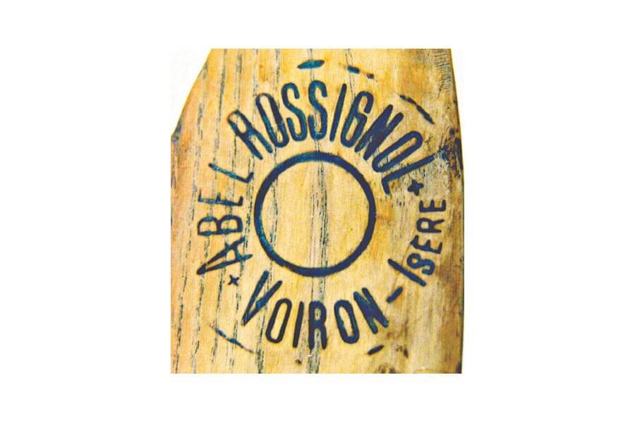
The logo used by the brand in the 1930s was a simple yet powerful and stylish monochrome banner logo ITC the name of the brand’s founder Abel Rossignol. It was written in the uppercase of a strict and modern sans-serif typeface on a narrow horizontally stretched rectangular in white, without any framing.
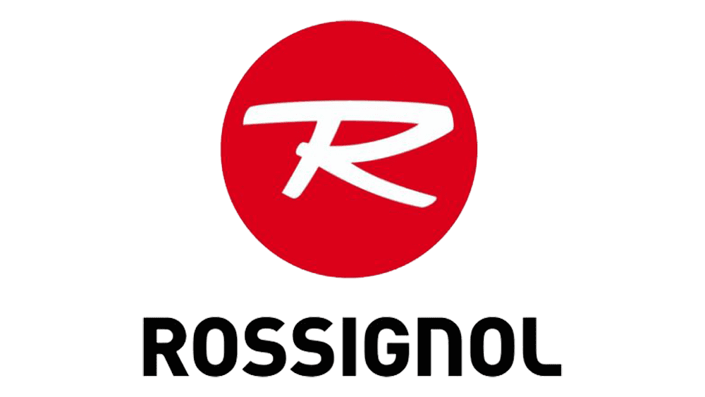
In 1956, they came up with a proper emblem: a red circle with a white ‘R’ as if hand-written in the center. Below, there’s the brand’s name written in black using soft, capital letters.
After another redesign, the Rossignol logo started looking completely different, though the monochrome color palette stayed with the brand. The new logo featured two parts — a graphical emblem and a logotype, placed under it. The logotype was executed in a custom italicized sans-serif typeface, with its uppercase letters looking progressive and strong. As for the emblem, it featured a solid black circle with a stylized white “R” written on it in smooth arched lines.
In 1987, they decided to return to the old 1956 concept, but changed the design. The circle turned black and now had a more illustrative ‘R’ made with two wide strokes. The lettering beneath consists of tilted capital letters written with a soft, yet sharp font.
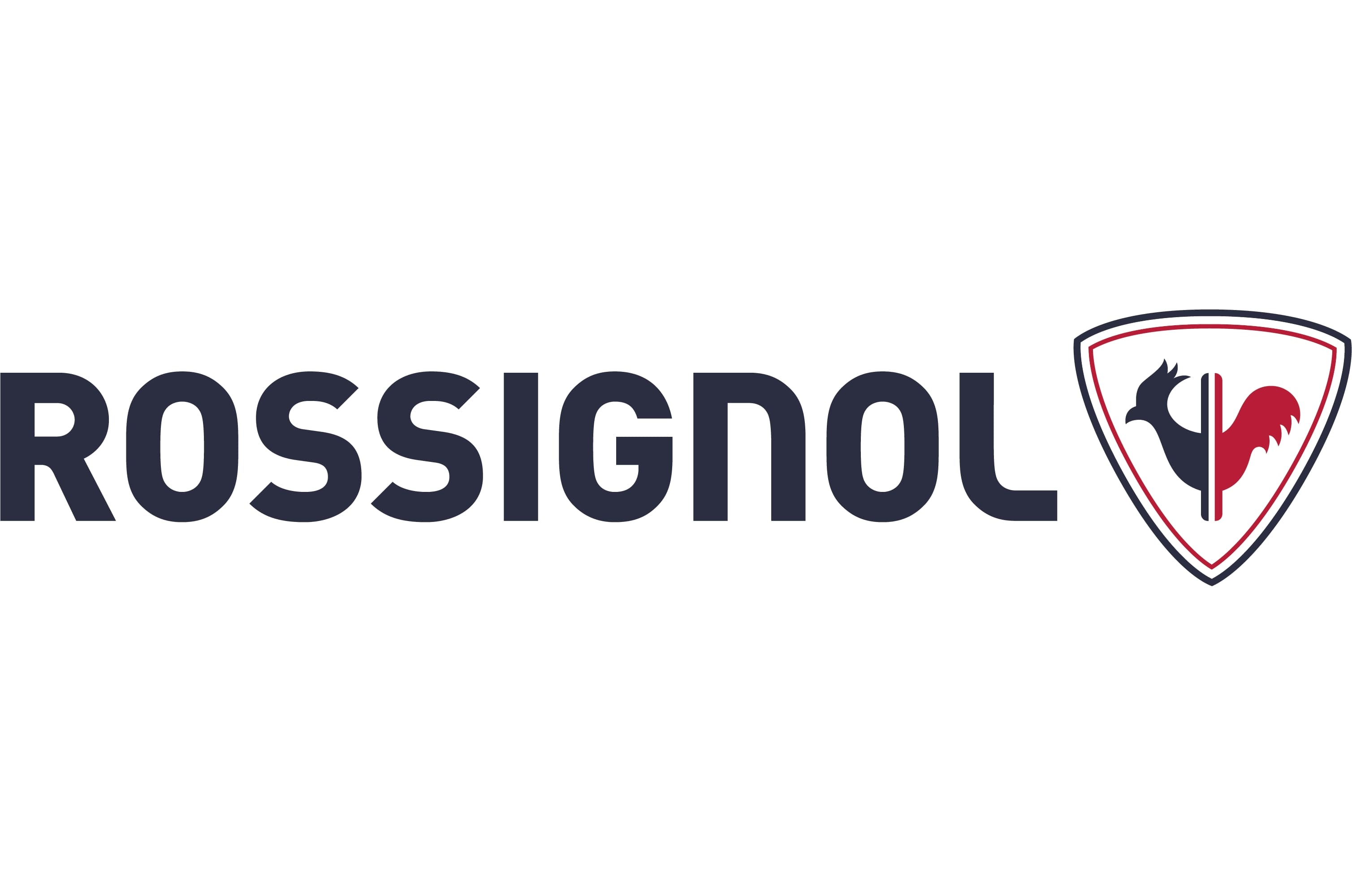
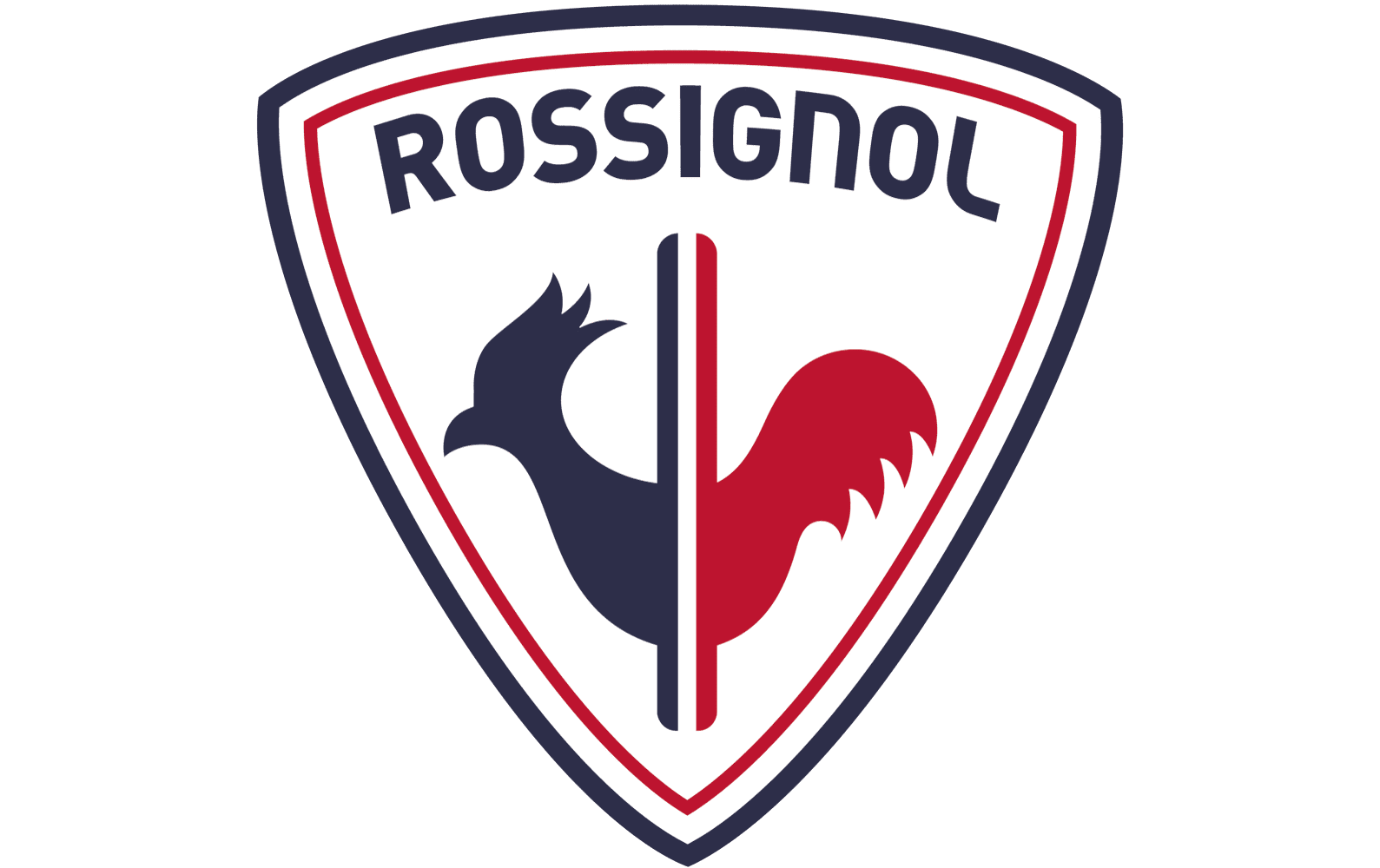
In 2006 the Rossignol logo was changed again. The new concept was built around the national French flag colors and the symbol of the country — the Rooster. It was drawn in blue and red and placed on a white background inside a triangular crest pointing down. The crest featured a double red and blue outline, which was balanced by the main symbol on the logo. A blue, white, and red vertical narrowed flag was coming through the rooster and finishing under the letter “I” of the logotype, which was arched along the upper border of the crest. The inscription in the uppercase was executed in dark blue color and used a modern and clean sans-serif typeface with smooth bold lines.
The redesign of 2019 removed the logotype from the crest and placed it on the left from the graphical emblem. The inscription was enlarged and became the main part of the brand’s visual identity. The typeface and color palette remained untouched, as well as the crest with the Rooster.
The name of the brand was not inspired by the bird but just used the second name of the founder. This can the reasonwhy the “nightingale” theme has never been supported in the Rossignol logo.
The most recognizable logo the company has had is probably the rooster. The bird is blue and red on the white background. The two stripes symbolize the skis. The V-shape used for the shield emphasizes the link with sport – the “V” is a universally recognized symbol of victory.
One more motif that has been used on Rossignol’s products quite often is a pair of parallel stripes. According to the company, this pattern was inspired by “the skis and the two tracks on the ski slopes.”
The palette of the Rossignol logo was inspired by the French flag, according to the company’s official website. In this way, Rossignol emphasizes the “sense of belonging to the French sporting community.” The combination of blue, white, and red looks slightly darker on the logo than it does on the flag, though.
The brand has often used a lighter shade of blue called Strato blue. The name refers to the legendary Strato ski, which was marketed from 1965 to 1975. It has been known as the first model to exceed the figure of a million pairs sold. The Strato ski had a blue base.
The sleek custom lettering from the primary Rossignol logo is set in the mixed case of a smooth futuristic sans-serif font, with all the characters featuring the same size. The closest types to the one, used in this insignia, are, probably, DIN 2014 ExtraBold, or Uni Neue Heavy, but with some modifications.
As for the color palette of the Rossignol visual identity, it is based on the iconic blue, red, and white tricolor, the scheme of the national flag of France, with the blue and red a hit darkened up and muted. These new shades of the familiar palette make the badge look extremely stylish and sleek.